Browse all docsPart 7 of 8
Responsiveness & Accessibility
Your catalogue looks right on every screen and works for every visitor - no configuration needed. One link is the single source of truth for phones, tablets, and desktops.
Part 7 of 83 min read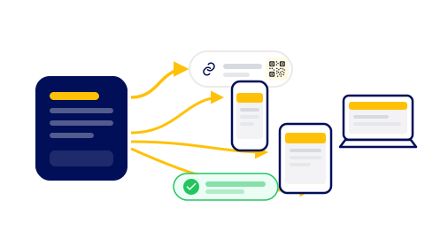
Most digital tools make you choose between a mobile experience and a desktop one, or maintain both in parallel. Quicktalog does not. Whatever screen your customer opens your catalogue on, they get the same content, the same prices, and the same updates - laid out to fit the device in front of them. You build once and it works everywhere.
Responsive by default
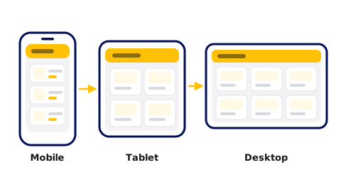
Every catalogue is built on a responsive layout. On a phone, items stack vertically and the text scales to a comfortable reading size. On a tablet or desktop, the same content spreads into a wider grid. You do not configure any of this. The layout adapts as soon as the page loads on any screen size, from the smallest phone to a large monitor.
This matters in practice because most customers open a catalogue link or scan a QR code on their phone. A page that breaks on a small screen or forces pinching and zooming loses people fast. Quicktalog handles the small-screen layout for you so you can focus on the content.
One catalogue, every screen
The single link you share is not a redirect to a mobile site or a simplified version. It is the catalogue itself, responsive. Every screen reads the same source, which means there is no drift between what a phone customer sees and what a desktop customer sees. Update a price, add a photo, change a description, and every device picks up the change the next time the page loads.
This single-source model also makes QR codes reliable over time. The code you print on a sign points to the same catalogue a customer finds via a link in your bio. Both always show the current version, because there is only one version.
Accessible out of the box
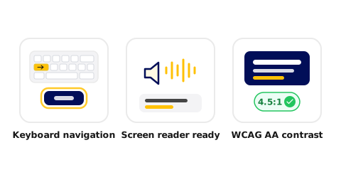
Accessibility is built into the catalogue structure, not added later. Heading levels follow a logical order so screen readers can navigate by section. All images include descriptive text that assistive technology reads aloud. Interactive elements like links and buttons are reachable by keyboard in a predictable tab order. Colour contrast between text and background meets the WCAG AA standard across all built-in themes.
This means customers who use screen readers, keyboard navigation, or high-contrast display modes can use your catalogue without any extra work on your part. Accessibility is not a feature to turn on. It is how the catalogue is built.
What you never have to do
Because responsiveness and accessibility are defaults, several things are simply not your problem. There is no separate mobile site to keep in sync. There is no app for your customers to download or update. There is no accessibility audit to run before you publish. And there is no version mismatch between what one group of customers sees and what another sees.
The practical result is less maintenance, not just at launch but permanently. When you change your catalogue, one publish reaches everyone, on every device, instantly.
Was this helpful?