Browse all docsPart 4 of 8
Customize the Design
Make a catalogue look like your brand. Pick a theme, set fonts and colours, and fill in the header and footer from the Appearance tab.
Part 4 of 84 min read
A catalogue should look like it belongs to your business, not like a template. Most of the styling lives under the Appearance tab, where a few choices change the whole feel of the page. You do not need design experience. The themes are built to look good out of the box, and you adjust from there.
Pick a theme
A theme sets the overall look: the colours, the spacing, and the mood. Start by picking the one closest to your brand, then refine it. This is the fastest way to a page that looks finished, because the hard design choices are already made for you.

Set fonts and colours
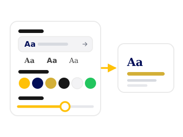
Choose a font from a long list to match your tone, from clean and modern to warm and classic. On higher plans you can also adjust colours, sizes, and shadows for a fully custom look. Keep it simple. One clear heading font and good contrast read better than a page full of competing styles.
Step 1: Open the Appearance tab
Find it in the builder settings panel. This is the home for themes, fonts, and styling.
Step 2: Choose a theme
Pick the theme closest to your brand. The preview updates instantly so you can compare a few quickly.
Step 3: Adjust fonts and colours
Set a font that fits your tone, then fine tune colours and sizes where your plan allows.
Set up the header
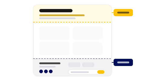
The header is the first thing a visitor sees. Add your heading and the key business details so people know who you are and what they are looking at within a second of opening the link.
Fill in the footer
The footer is where the practical details live: your business information, social links, and partners. Some plans also let you collect newsletter sign ups here, which turns a one time visit into a way to reach people again.

Was this helpful?